Text
O Text é o componente de texto, utilizado para escrever e formatar blocos de conteúdo dentro de páginas ou componentes.
import React from "react";
import { Text } from "@nimbus-ds/components";

const Example: React.FC = () => <Text as="p">Lorem ipsum dolor sit amet</Text>;

export default Example;O componente Text é composto por um (p) ou (span) estilizado que consome nossos tokens de tipografia para o body, sendo eles o base, o caption e o small.
O conteúdo do componente pode ser alinhado à esquerda, ao centro e à direita. O critério de uso de cada um pode variar caso a caso, sendo o mais comum a esquerda para texto corrido, ao centro para informações únicas ou pontuais e a direita para textos dentro de listas de informações.
O componente permite formatar trechos de conteúdo, sendo possível personalizar o peso e a cor usando a propriedade span.
Utilizamos o Text para escrever texto corrido com hierarquia básica, além de formatar trechos específicos de conteúdo.
Componente Title - Usado para dar título e subtítulo a telas, páginas, blocos de texto, seções ou outros componentes, empregando hierarquia visual e semântica.
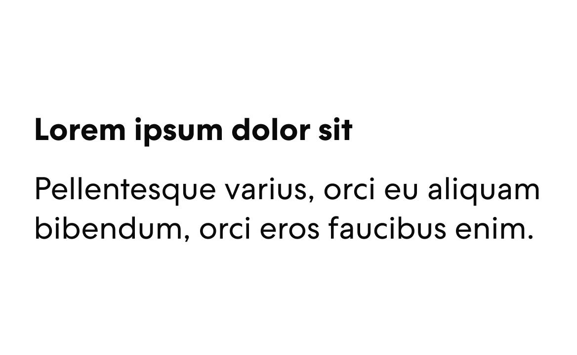
Textos em bold devem ser usados para destacar informações pontualmente.
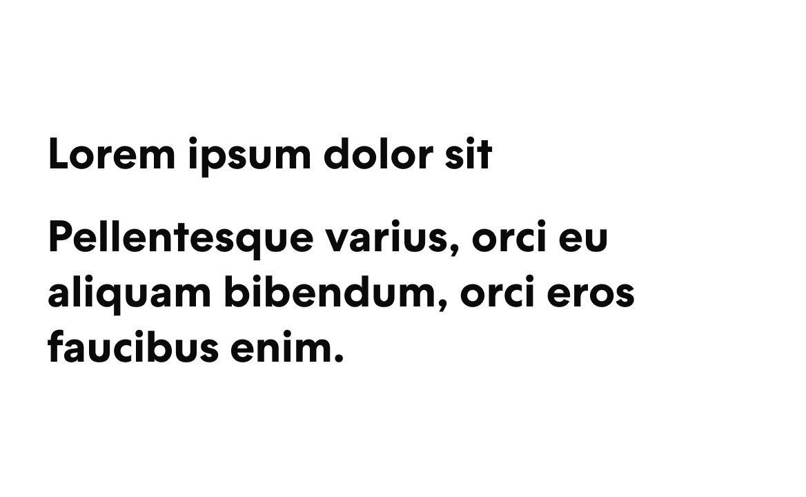
O bold deve ser usado com parcimônia, evitando longos blocos de texto.
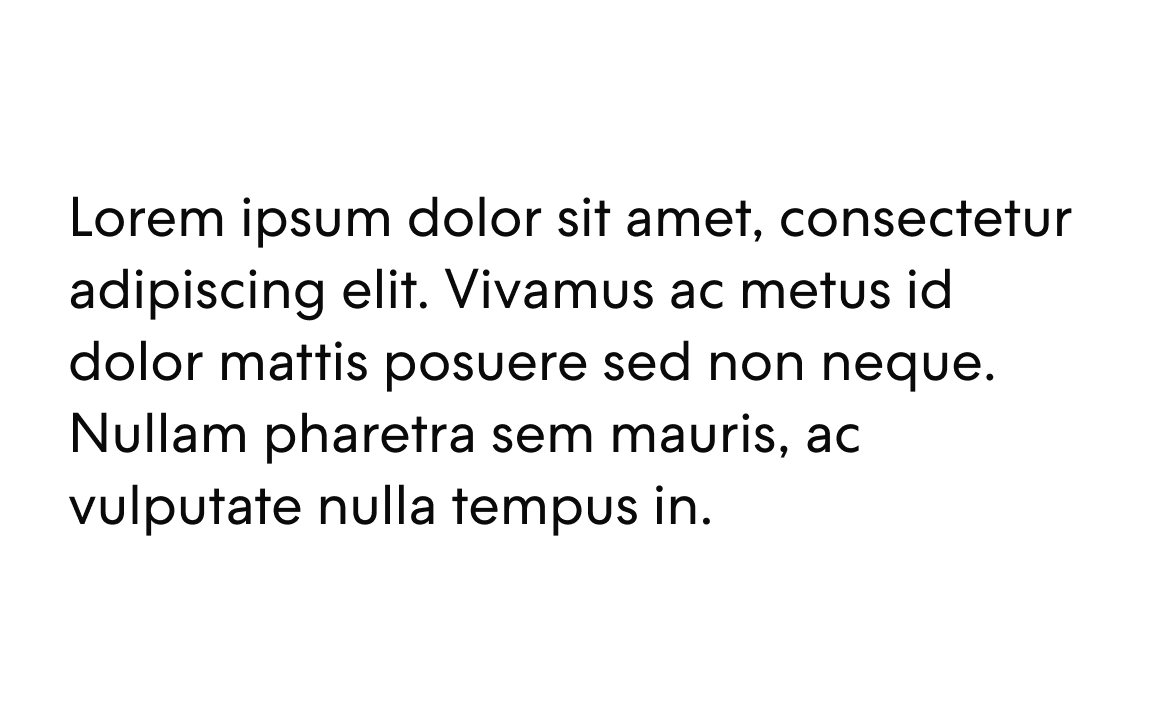
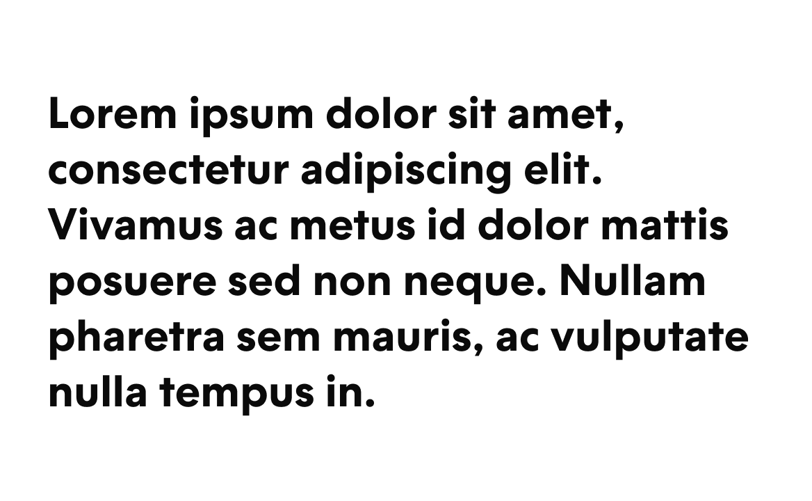
Para textos longos devemos dar preferência a estilos tamanho base.
Tamanhos de texto Highlight deve ser evitado para textos longos.
Quando temos conteúdos diferentes em uma mesma linha, devemos manter o mesmo estilo de texto.

Não devemos ter tamanhos contrastantes em uma mesma linha.

Para textos é importante usar cores que não se confundam com outros tipos de elementos.

A cor do conteúdo não deve ser parecida com as cores interativas.
Instale o componente via terminal.
npm install @nimbus-ds/textPropriedades adicionais são repassadas ao elemento <Text>. Consulte a documentação do elemento div para ver a lista de atributos aceitos pelo elemento <Text>.
Text
| Name | Type | Default | Description |
|---|---|---|---|
children* | React.ReactNode | The content of the link. | |
as | 'p' | 'p' | Type of html tag to create for the Text component. |
fontSize | 'base' | 'base' | The fontSize property sets the size of the text. This is a responsive property and you can have the options below available for you to use. '{ "xs": "value", "md": "value", "lg": "value", "xl": "value", "xxl": "value" }' |
fontWeight | 'bold' | 'regular' | The fontWeight property sets how thick or thin characters in text should be displayed. This is a responsive property and you can have the options below available for you to use. '{ "xs": "value", "md": "value", "lg": "value", "xl": "value", "xxl": "value" }' |
color | 'ai-generative' | 'neutral-textLow' | The color property is used to set the color of the text. Note: Gradients like 'ai-generative' changes other properties like 'width' and 'display', which could make the component behave differently. Ensure to visually test the component when dynamically changing the color. This is a responsive property and you can have the options below available for you to use. '{ "xs": "value", "md": "value", "lg": "value", "xl": "value", "xxl": "value" }' |
lineHeight | 'base' | 'base' | The lineHeight property specifies the line height of the text. This is a responsive property and you can have the options below available for you to use. '{ "xs": "value", "md": "value", "lg": "value", "xl": "value", "xxl": "value" }' |
textAlign | 'center' | 'left' | The textAlign property specifies the horizontal alignment of text. This is a responsive property and you can have the options below available for you to use. '{ "xs": "value", "md": "value", "lg": "value", "xl": "value", "xxl": "value" }' |
textOverflow | 'clip' | The textOverflow property specifies how overflowed content that is not displayed should be signaled to the user (e.g., 'ellipsis' for '...', 'clip' for hard cutoff). Note: This property only works when overflow is set to 'hidden'. This is a responsive property and you can have the options below available for you to use. '{ "xs": "value", "md": "value", "lg": "value", "xl": "value", "xxl": "value" }' | |
whiteSpace | 'break-spaces' | The whiteSpace property sets how white space inside an element is handled. This is a responsive property and you can have the options below available for you to use. '{ "xs": "value", "md": "value", "lg": "value", "xl": "value", "xxl": "value" }' | |
wordBreak | 'break-all' | The wordBreak property sets whether line breaks appear wherever the text would otherwise overflow its content box. This is a responsive property and you can have the options below available for you to use. '{ "xs": "value", "md": "value", "lg": "value", "xl": "value", "xxl": "value" }' | |
lineClamp | number | The amount of lines at which the text will be trimmed, showing an ellipsis when overflowed. This is a responsive property and you can have the options below available for you to use. '{ "xs": "value", "md": "value", "lg": "value", "xl": "value", "xxl": "value" }' | |
overflow | 'auto' | The overflow property specifies what happens if content overflows an element's box. This is a responsive property and you can have the options below available for you to use. '{ "xs": "value", "md": "value", "lg": "value", "xl": "value", "xxl": "value" }' | |
textDecoration | 'line-through' | The textDecoration shorthand property sets the appearance of decorative lines on text. This is a responsive property and you can have the options below available for you to use. '{ "xs": "value", "md": "value", "lg": "value", "xl": "value", "xxl": "value" }' |
Text.Skeleton
| Name | Type | Default | Description |
|---|---|---|---|
fontSize | 'base' | ||
width | string | Width of the skeleton. Useful when the skeleton is inside an inline element with no width of its own. | |
className | string | ||
height | string | Height of the skeleton. Useful when you don't want to adapt the skeleton to a text element but for instance a card. | |
data-testid | string | This is an attribute used to identify a DOM node for testing purposes. |