Text
Text es el componente de texto, utilizado para escribir y formatear bloques de contenido dentro de páginas y componentes.
import React from "react";
import { Text } from "@nimbus-ds/components";

const Example: React.FC = () => <Text as="p">Lorem ipsum dolor sit amet</Text>;

export default Example;El componente Text posee un elemento HTML (p) o (span) estilizado utilizando nuestros tokens de tipografía para el body, pudiendo ser base, caption o small.
El contenido del componente puede ser alineado a la izquierda, centro o derecha. El criterio de uso de cada uno puede variar caso a caso, siendo más común el alineamiento a la izquierda para texto de corrido, al centro para informaciones únicas o puntuales y a la derecha para textos dentro de listas.
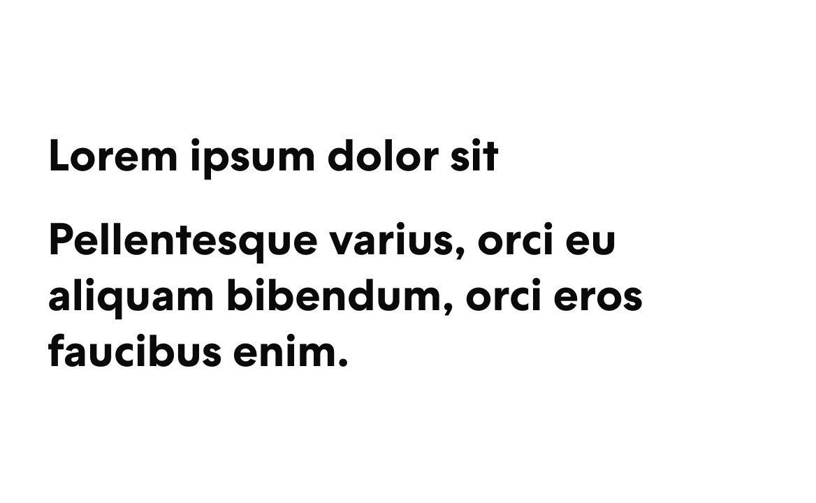
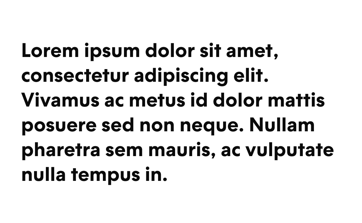
El componente permite formatear bloques de contenido, siendo posible personalizar el peso y el color usando las propiedades disponibles.
Usamos Text para escribir texto de corrido con jerarquía básica, además de formatear bloques específicos de contenido.
Componente Title - Usado para titular pantallas, páginas, bloques de texto, secciones u otros componentes, utilizando jerarquía visual y semántica.

El texto en negrita se debe utilizar para resaltar la información puntualmente.
La negrita debe usarse con moderación, evitando bloques largos de texto.

Para textos largos debemos dar preferencia a los estilos de longitud base.
los tamaños de texto resaltados deben evitarse para textos largos.
Cuando tenemos diferentes contenidos en una misma línea, debemos mantener el mismo estilo de texto.

No deberíamos tener tamaños contrastantes en la misma línea.

Para los textos es importante utilizar colores que no se mezclen con otro type de elementos.

El color del contenido no debe ser similar a los colores interactivos.
Instalá el componente via terminal.
npm install @nimbus-ds/textLas propiedades adicionales se pasan al elemento <Text>. Consultá la documentación para ver la lista de atributos aceptados por el elemento <Text>.
Text
| Name | Type | Default | Description |
|---|---|---|---|
children* | React.ReactNode | The content of the link. | |
as | 'p' | 'p' | Type of html tag to create for the Text component. |
fontSize | 'base' | 'base' | The fontSize property sets the size of the text. This is a responsive property and you can have the options below available for you to use. '{ "xs": "value", "md": "value", "lg": "value", "xl": "value", "xxl": "value" }' |
fontWeight | 'bold' | 'regular' | The fontWeight property sets how thick or thin characters in text should be displayed. This is a responsive property and you can have the options below available for you to use. '{ "xs": "value", "md": "value", "lg": "value", "xl": "value", "xxl": "value" }' |
color | 'ai-generative' | 'neutral-textLow' | The color property is used to set the color of the text. Note: Gradients like 'ai-generative' changes other properties like 'width' and 'display', which could make the component behave differently. Ensure to visually test the component when dynamically changing the color. This is a responsive property and you can have the options below available for you to use. '{ "xs": "value", "md": "value", "lg": "value", "xl": "value", "xxl": "value" }' |
lineHeight | 'base' | 'base' | The lineHeight property specifies the line height of the text. This is a responsive property and you can have the options below available for you to use. '{ "xs": "value", "md": "value", "lg": "value", "xl": "value", "xxl": "value" }' |
textAlign | 'center' | 'left' | The textAlign property specifies the horizontal alignment of text. This is a responsive property and you can have the options below available for you to use. '{ "xs": "value", "md": "value", "lg": "value", "xl": "value", "xxl": "value" }' |
textOverflow | 'clip' | The textOverflow property specifies how overflowed content that is not displayed should be signaled to the user (e.g., 'ellipsis' for '...', 'clip' for hard cutoff). Note: This property only works when overflow is set to 'hidden'. This is a responsive property and you can have the options below available for you to use. '{ "xs": "value", "md": "value", "lg": "value", "xl": "value", "xxl": "value" }' | |
whiteSpace | 'break-spaces' | The whiteSpace property sets how white space inside an element is handled. This is a responsive property and you can have the options below available for you to use. '{ "xs": "value", "md": "value", "lg": "value", "xl": "value", "xxl": "value" }' | |
wordBreak | 'break-all' | The wordBreak property sets whether line breaks appear wherever the text would otherwise overflow its content box. This is a responsive property and you can have the options below available for you to use. '{ "xs": "value", "md": "value", "lg": "value", "xl": "value", "xxl": "value" }' | |
lineClamp | number | The amount of lines at which the text will be trimmed, showing an ellipsis when overflowed. This is a responsive property and you can have the options below available for you to use. '{ "xs": "value", "md": "value", "lg": "value", "xl": "value", "xxl": "value" }' | |
overflow | 'auto' | The overflow property specifies what happens if content overflows an element's box. This is a responsive property and you can have the options below available for you to use. '{ "xs": "value", "md": "value", "lg": "value", "xl": "value", "xxl": "value" }' | |
textDecoration | 'line-through' | The textDecoration shorthand property sets the appearance of decorative lines on text. This is a responsive property and you can have the options below available for you to use. '{ "xs": "value", "md": "value", "lg": "value", "xl": "value", "xxl": "value" }' |
Text.Skeleton
| Name | Type | Default | Description |
|---|---|---|---|
fontSize | 'base' | ||
width | string | Width of the skeleton. Useful when the skeleton is inside an inline element with no width of its own. | |
className | string | ||
height | string | Height of the skeleton. Useful when you don't want to adapt the skeleton to a text element but for instance a card. | |
data-testid | string | This is an attribute used to identify a DOM node for testing purposes. |