Title
Title es un componente de texto, pensado para dar jerarquía visual y semántica a los contenidos de una página.
Usado para el título de la página, debe usarse una vez por página.
import React from "react";
import { Title } from "@nimbus-ds/components";

const Example: React.FC = () => (
  <Title as="h1">Lorem ipsum dolor sit amet</Title>
);

export default Example;Title es un componente de texto, pensado para dar jerarquía visual y semántica a los contenidos de una página.
Posee dos niveles de jerarquía, semántica y visual. Las dos funcionan de forma independiente pudiendo ser combinadas entre sí.
Semántica
La jerarquía semántica se aplica por medio de tags HTML (h1, h2, h3, h4, h5 y h6). Éstas sirven para delimitar secciones de contenido para navegadores web, plugins y tecnologías asistivas. Es por esto que debemos tener en cuenta que el h1 tiene el mayor nivel jerárquico y el h6, el menor.
Estas clasificaciones pueden ser combinadas para delimitar secciones y subsecciones de contenido de acuerdo con la necesidad. Para más información consultar las recomendaciones de la W3 para títulos.
Visual
La jerarquía visual se aplica por medio de nuestros tokens de tipografía, que pueden aumentar o disminuir el destaque en determinados títulos o subtítulos, sin interferir con las cuestiones semánticas.
Usamos el Title para titular pantallas, páginas, bloques de texto, secciones y/u otros componentes, aplicando jerarquía visual y semántica.
Componente Text - Usado para texto de corrido, párrafos y oraciones.

Los títulos deben usarse para jerarquizar la información en una página.
No deberíamos tener más de un H1 por página.

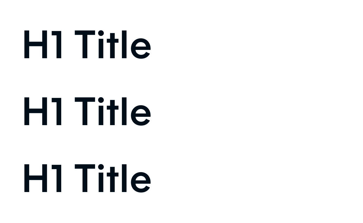
En un título debemos mantener siempre el mismo estilo en toda la línea.

Los títulos deben tener un solo estilo de texto, sin variar los estilos a lo largo de la línea.
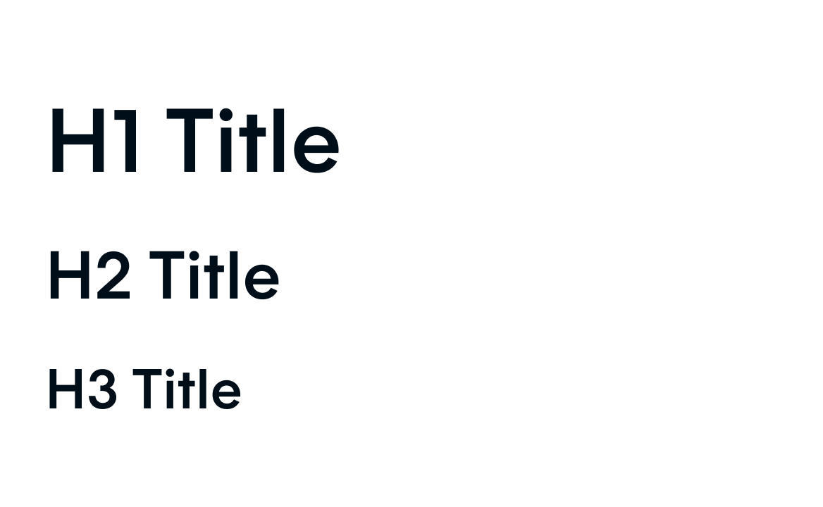
Los títulos deben seguir el orden de mayor a menor.

No debemos tener títulos fuera de un orden secuencial lógico.

Debemos asegurarnos de que los colores del texto tengan suficiente contraste con el fondo.

los títulos deben usar colores de alto o bajo contraste para asegurarse de que sean legibles.
Instalá el componente via terminal.
npm install @nimbus-ds/titleLas propiedades adicionales se pasan al elemento <Title>. Consultá la documentación para ver la lista de atributos aceptados por el elemento <Title>.
Title
| Name | Type | Default | Description |
|---|---|---|---|
children* | React.ReactNode | The content of the title. | |
as | 'h1' | 'h1' | Type of html tag to create for the title. |
fontSize | '0-5' | 'base' | The fontSize property sets the size of the title. This is a responsive property and you can have the options below available for you to use. '{ "xs": "value", "md": "value", "lg": "value", "xl": "value", "xxl": "value" }' |
fontWeight | 'bold' | 'regular' | The fontWeight property sets how thick or thin characters in title should be displayed. This is a responsive property and you can have the options below available for you to use. '{ "xs": "value", "md": "value", "lg": "value", "xl": "value", "xxl": "value" }' |
lineHeight | '0-5' | 'base' | The lineHeight property specifies the line height of the title. This is a responsive property and you can have the options below available for you to use. '{ "xs": "value", "md": "value", "lg": "value", "xl": "value", "xxl": "value" }' |
textAlign | 'center' | 'left' | The textAlign property specifies the horizontal alignment of title. This is a responsive property and you can have the options below available for you to use. '{ "xs": "value", "md": "value", "lg": "value", "xl": "value", "xxl": "value" }' |
color | 'danger-textHigh' | 'neutral-textLow' | The color property is used to set the color of the title. This is a responsive property and you can have the options below available for you to use. '{ "xs": "value", "md": "value", "lg": "value", "xl": "value", "xxl": "value" }' |
Title.Skeleton
| Name | Type | Default | Description |
|---|---|---|---|
as | 'h1' | 'h1' | Type of html tag to create for the title. |
width | string | Width of the skeleton. Useful when the skeleton is inside an inline element with no width of its own. | |
className | string | ||
height | string | Height of the skeleton. Useful when you don't want to adapt the skeleton to a text element but for instance a card. | |
data-testid | string | This is an attribute used to identify a DOM node for testing purposes. |